
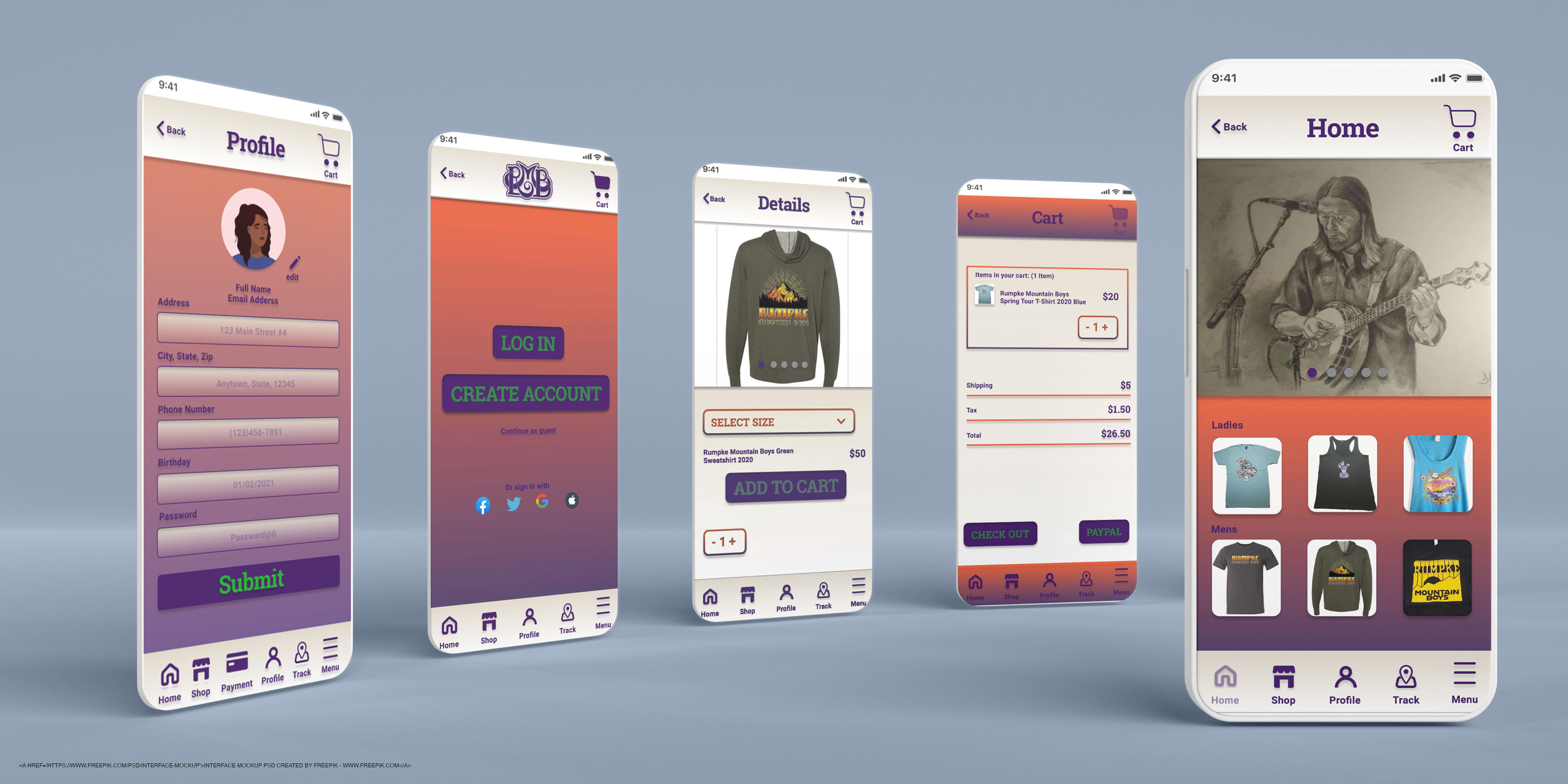
Photoshop mockup of Home, Cart, Detail, Splash and profile screens
Ladies styles:
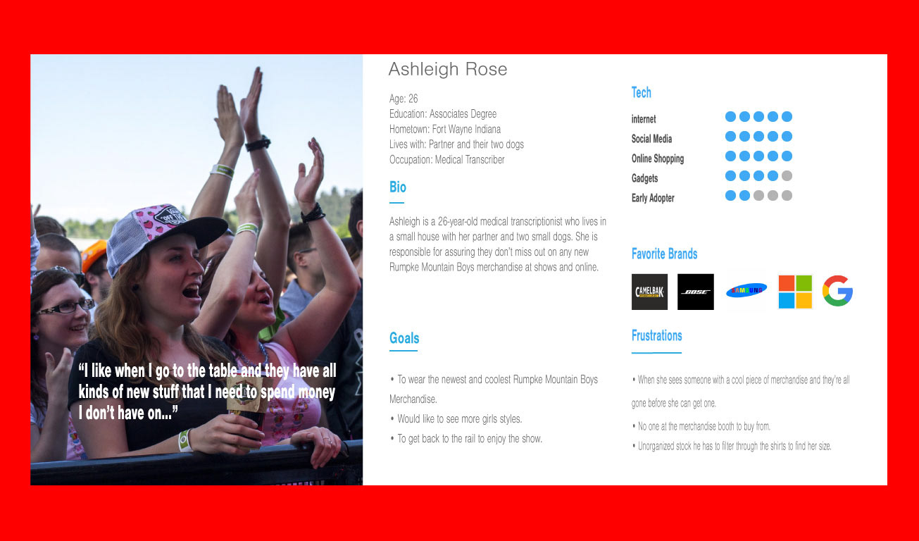
Ashleigh Rose Persona with image of Ashleigh at a concert
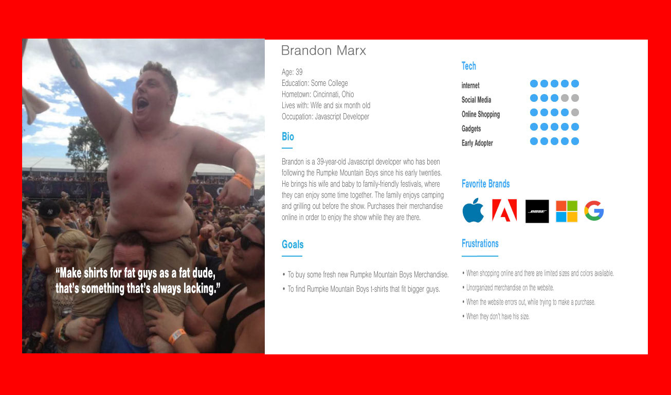
Brandon Marx Persona with image of Brandon at a concert
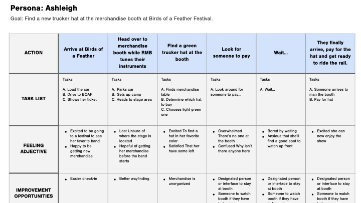
Ashleigh's User Journey Map to find a new trucker hat at the merchandise booth
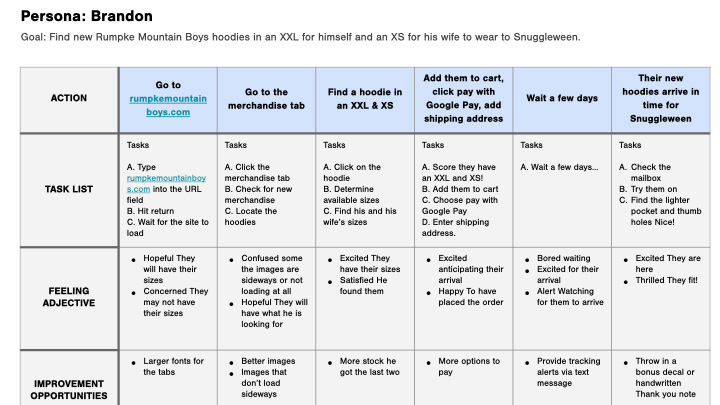
Brandon User Journey To find Rumpke Mountain Boys hoodies in an XXL
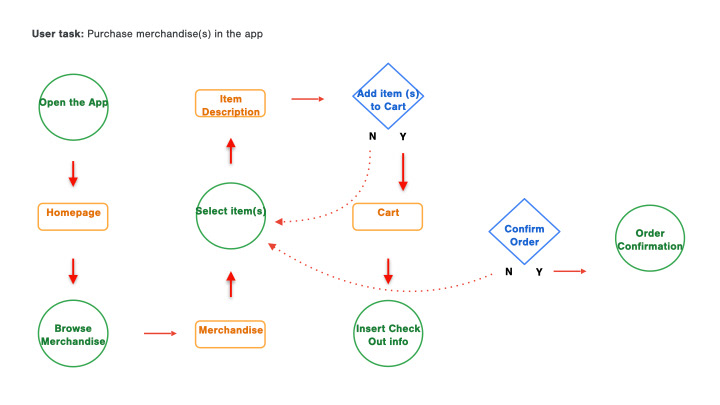
User task map
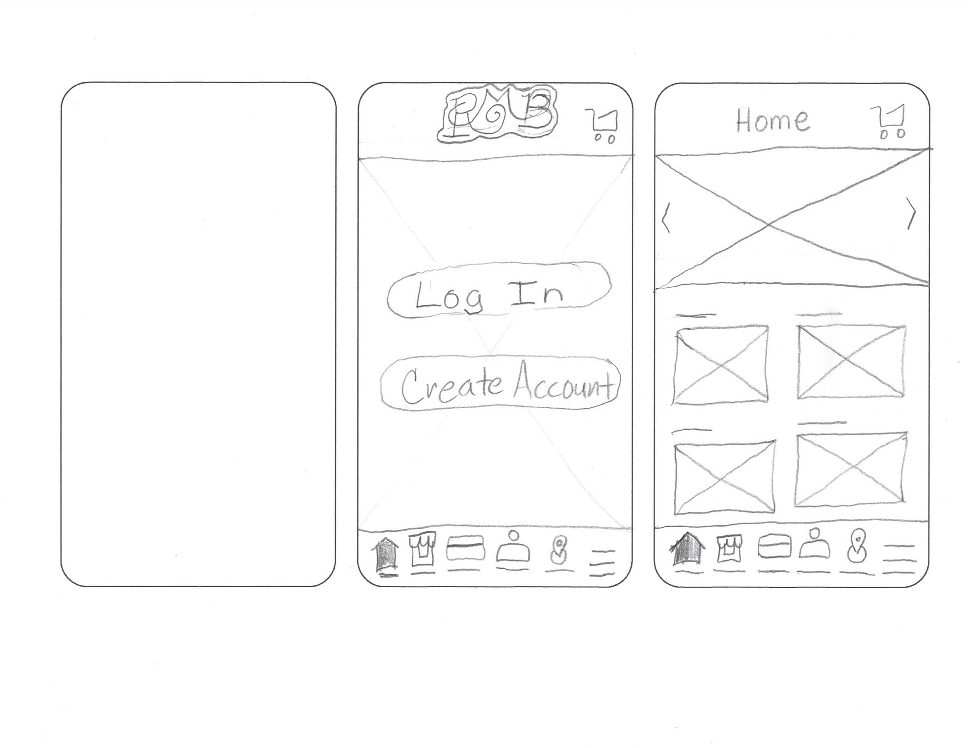
Home and Log-in screens paper wireframe
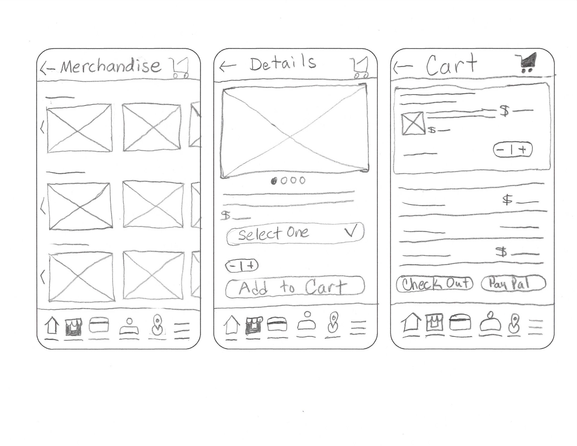
Merchandise, Details and Cart screens paper wireframes
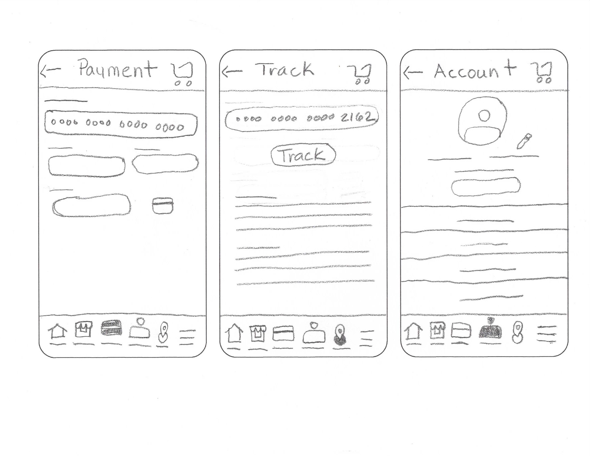
Payment, Tracking and Account paper wireframes
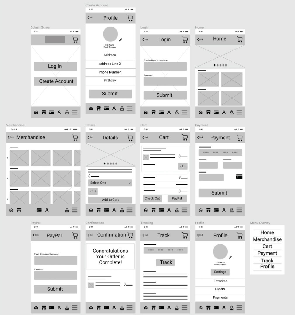
Splash, Create Account, Log-in, Home, Merchandise, Details, Cart, Payment, PayPal, Confirmation, Tracking, Profile and Menu screens digital wireframes

Gif of user flow purchasing an item Low-fi prototype
2. If we type out the categories rather than having just lines, it would be less confusing for users.
3. Users want to add input data to the prototype.
2. Users took extra time to get to the Merchandise Screen from the Home Screen.
3. Users were confused by the keyboard that moved on and off the screen too fast.
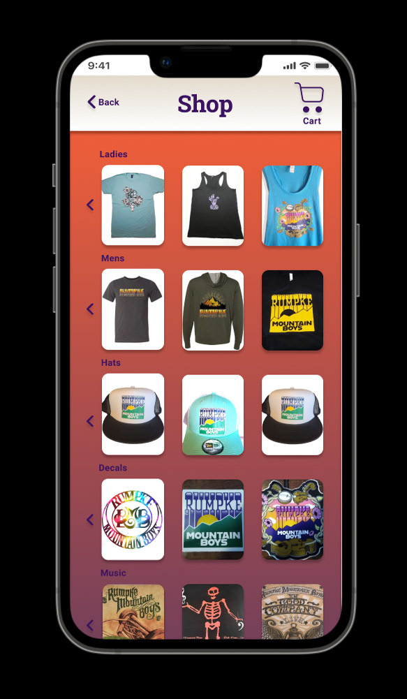
Digital mockup of Merchandise screen before usability study
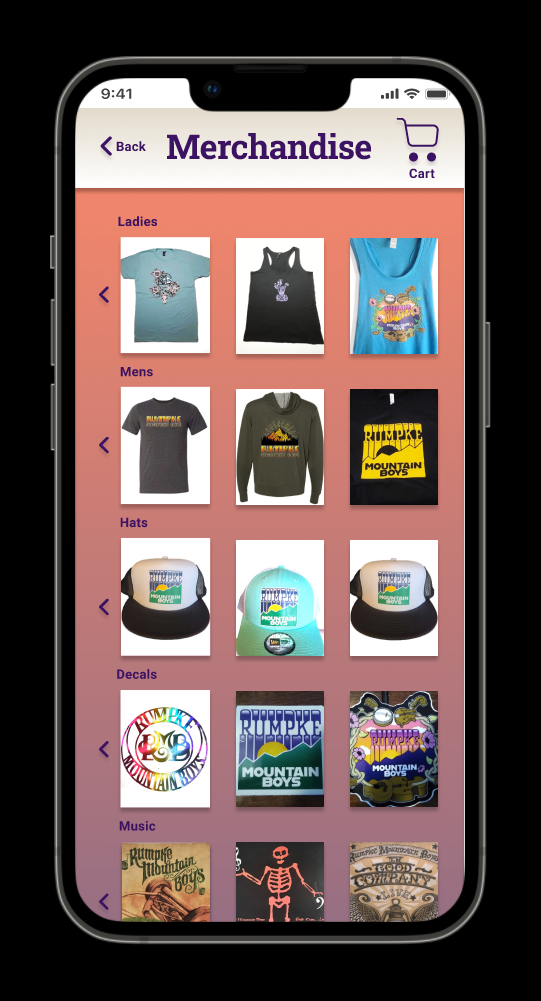
Digital mockup of Merchandise screen after usability study
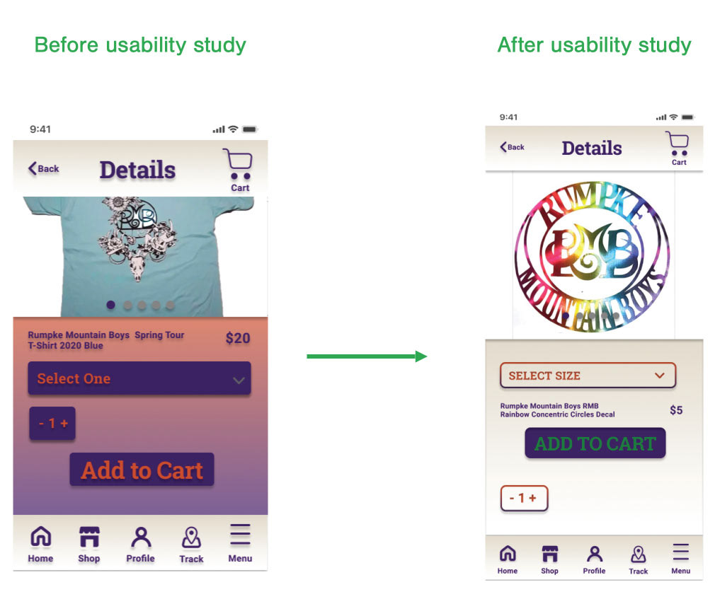
Digital mockups of Details screen before and after usability study
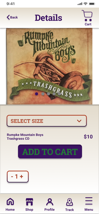
Mockup of Details screen
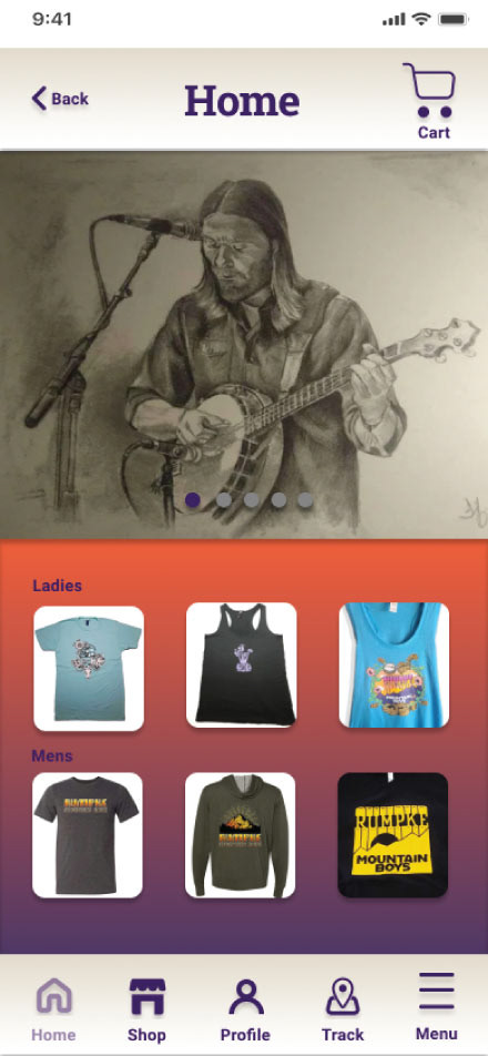
Mockup of Home screen
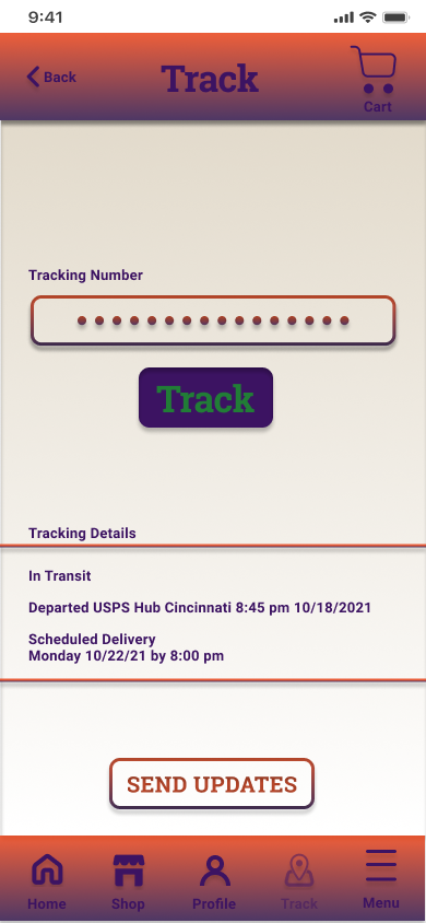
Mockup of Tracking screen
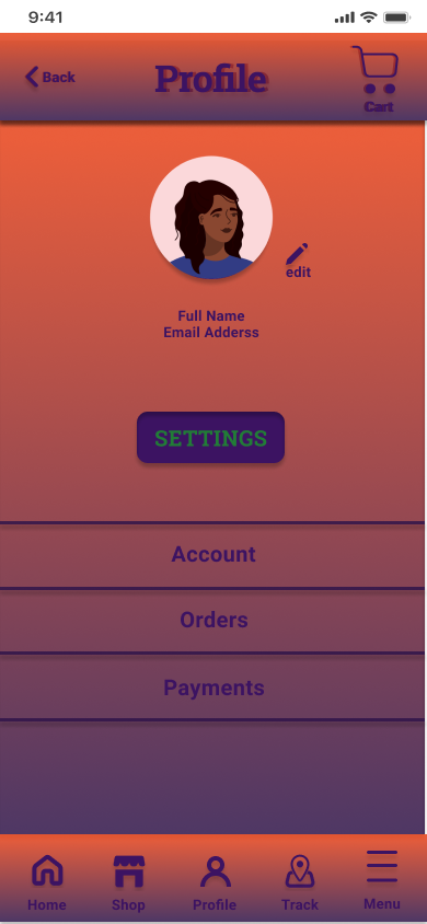
Mockup of Profile screen
Hi-fidelity prototype of user flow of purchasing an item in the app
3. Changed the Keyboard timing on the screen to avoid jerky movements and prevent seizures.
4. Included icons with the names typed below them to make them more legible.
2. Send to the Rumpke Mountain Boys for approval.
3. Send to engineering team for implementation.